
Chief Trader for Chief Securities
Chief Group is a leading financial institution in Hong Kong, offering comprehensive securities trading and wealth management services. With over 40 years of experience in the industry, Chief provides a full suite of investment solutions—from local and global stock trading, futures and options, to asset management and financial advisory.

Project Background
-
Trade across multiple markets
-
Flexible monthly contribution plans covering HK stocks, U.S. stocks, and mutual funds, with access to over 500 investment options.
-
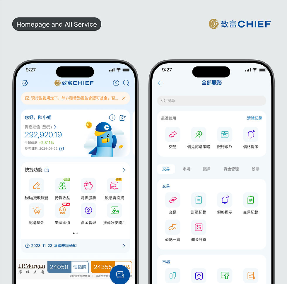
Real-time net asset value display and individual stock P/L summaries
As an in-house UI/UX Designer at Chief Group, I collaborate closely with cross-functional teams—including product managers, developers, and business analysts—to design and enhance digital experiences for mobile platforms within the financial services landscape.
My Role

Requirements Gathering
Collaborate closely with the business analyst to understand the specific requirements and goals of the projects

Usability and User Experience
Focus on enhancing the app's usability and user experience by simplifying complex concepts, providing educational resources, and guiding new clients through the process

User Testing and Iteration
Gather feedback to Iterate on the UI/UX designs based on user feedback, in coordination with the business analysis team, to address usability issues, information hierarchy, and visual clarity.

Concept Development
Translate the gathered requirements and user insights into intuitive and visually appealing user interface designs

Collaboration
Work closely with the development team, business analysts, and other stakeholders to ensure the feasibility and successful implementation of the proposed UI/UX designs
As a UI/UX designer,
I played a key role in modernizing and systematizing the design language to ensure greater consistency, scalability, and user clarity across features.
... scroll for details or see my work

Mood and Feel
To align with the needs of a younger and more design-conscious audience, I led a redesign of the app’s overall tone and feel, transitioning from a dense, dark interface to a brighter, cleaner aesthetic.
-
Lightened Visual Theme:
Improves readability and brings a sense of openness and ease to the financial experience. -
Clearer Layout & Hierarchy:
Reorganized interface elements with improved white space, consistent margins, and streamlined visual hierarchy to enhance user focus and reduce cognitive load

Icongraphy
I redesigned the service icons with a modern, minimal line-based style to improve clarity, consistency, and recognizability. The new icon set reflects a balance of simplicity and functionality through:
-
Soft asymmetry in corner radius:
Each icon follows a consistent corner rule: the top-left and bottom-right corners are rounded at 4px, while the top-right and bottom-left corners are set at 1px -
Consistent spacing and alignment:
All icons are designed within a 4x4px padding system, ensuring even spacing and optical balance across different categories

Visual Rhythm
By introducing intentional pauses through spacing, the interface now feels lighter, more organized, and less overwhelming—making it easier for users to focus on key actions and information.
-
Consistent padding, margin, and spacing rules:
Create a more breathable layout that naturally guides the user’s attention across the screen -
Reduce cognitive overload:
Increase the use of white space between content blocks, UI elements, and functional sections.

Micro-interactions & Feedback
To enhance user engagement and provide a more responsive experience, I refined micro-interactions across the app.
-
Clear and gentle feedback:
The design reassures users that their input has been acknowledged, thereby improving usability, building trust, and making the overall app feel more alive and intuitive
Through a systematic redesign of the app’s visual language, including iconography, color palette, spacing, and micro-interactions, I created a lighter, friendlier, and more cohesive experience that better supports users of all ages and backgrounds.
Feature Design Highlights
A dynamic homepage with smart shortcuts and simplified insights for fast, modern trading.
Seamlessly collect, manage, and use coupons with an experience designed for clarity and control.

A smart investment feature that helps users grow their wealth effortlessly through flexible, recurring contributions

Describe the product here. Include important features, pricing and other relevant info. Consider adding an image or video of the product.


